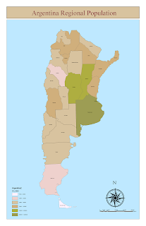
For my first map, I used a typical color distribution to show population density. This looks nice and displays the differences, but only the two extremes really stand out.
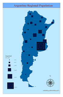
For this map, I chose a different approach for differentiation. I like how the distributions are distributed in such a way as to immediately tell the population size for each region, Buenas Aires having obviously the much greater numbers. The region lines did not show up as well as I thought.
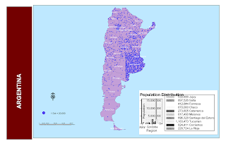
For this map, I wanted to show the population with a little different impact. I also made and inserted a graph. The original showed all the regions and looked very nice. However, when I finished and inserted it, only a few of the regions showed, and I could not change the appearance of the graph itself, such as size and placement of font, etc. I can see why extra items are better off made in another program and inserted.
 For my first map, I used a typical color distribution to show population density. This looks nice and displays the differences, but only the two extremes really stand out.
 For this map, I chose a different approach for differentiation. I like how the distributions are distributed in such a way as to immediately tell the population size for each region, Buenas Aires having obviously the much greater numbers. The region lines did not show up as well as I thought.
 For this map, I wanted to show the population with a little different impact. I also made and inserted a graph. The original showed all the regions and looked very nice. However, when I finished and inserted it, only a few of the regions showed, and I could not change the appearance of the graph itself, such as size and placement of font, etc. I can see why extra items are better off made in another program and inserted.
No comments:
Post a Comment