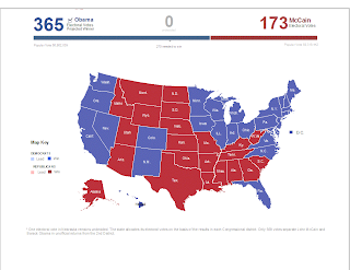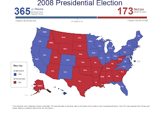

Here are my two election maps. I was amazed that I could make the first one like the original, with only one other ArcGIS assignment. It did take me three tries and many days. For the improved map, I wanted to add something, but remembered the rule of "one map, one purpose", so I did not. Nor did I change the map to become another map, but instead decided to improve the original map by adding black borders and darkening and enlarging the font to make it more legible. I removed the extraneous "Lead" information as it was distracting and confusing, and I removed the "undecided" information for the same reason. I believe the map is easier to read and understand now. I added a title so people would know what the map was about when it is looked at in the future. I enlarged and centered the states to take up the extra room left from the removal of the interactive things. It is centered and better looking.
No comments:
Post a Comment