For the final version of my UCLA Educational Journey map, I included only one city for each Geography faculty member, adding the names of the other cities in the journey descriptions.
I couldn't help but notice a correlation to another map I made of the educational disparity in the world. There were no universities mentioned in either Africa or the Americas, south of the United States. It seems there is a great need for quality higher education in the southern hemisphere countries.
Monday, March 16, 2009
Saturday, March 14, 2009
Tuesday, March 3, 2009
Wednesday, February 25, 2009
Chloropleth, Dot, and Symbol Maps
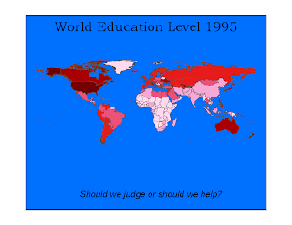
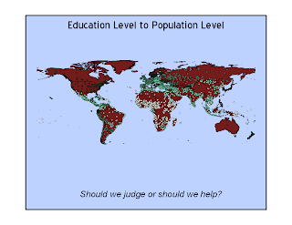
After a week of trying and failing, I realized that there was something wrong with the computer I was on. I never was able to access the information other students had because the files wouldn't open. Also, I was not able to select 100 cities, counties, etc. So, I tried a different computer, and lo and behold, it worked. I rushed it, so did not get strictly 100 places. I chose individual cities for the chloropleth because I feel that in addition to education level, the number of individual sites gives a greater impression of the impact and amount of education than a straight fill-in color. I added the country chloropleth map for comparison.
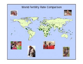
I like the small scale symbols on this map because the countries with the lowest fertility rates are surprisingly obvious.
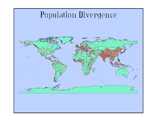 I felt like I needed a plain background for these maps because the various islands and symbols would get lost in a fancy background.
Monday, February 23, 2009
Wednesday, February 18, 2009
A Day in the Life of Three UCLA Students
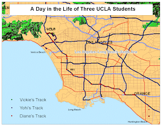 We started with this map, but found that it didn't look quite the way we wanted, so we moved on to the format below.
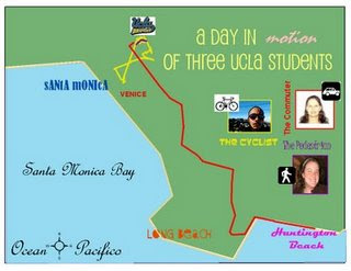
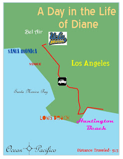
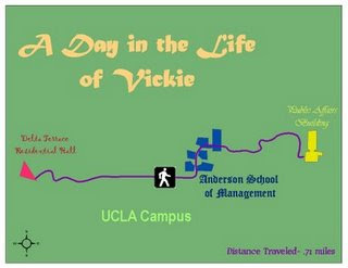
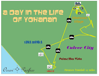
Twice a week, this is really all I do in a day:
Drive to school at 6:00 a.m., work here all day, then
drive home at 9:00p.m. I'm glad I like it here!
We made regular street maps, but then they looked like regular street maps with dots on them. This is interesting, simple, visually appealing, and gets the basic point across.
Monday, February 2, 2009
Graphic Design Black & White
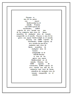
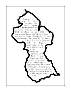 Some of the type and graphics look gray on the website, but if the pictures are enlarged, they do show up as black and white. That is really all I used.
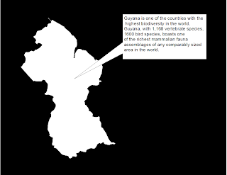
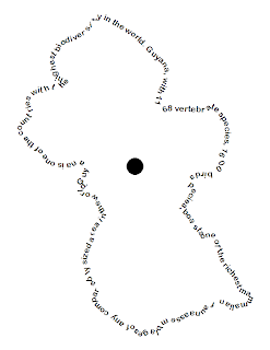
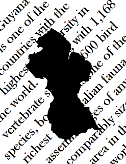
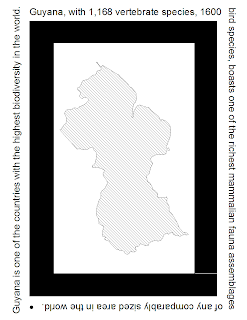
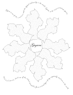
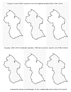
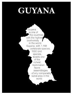
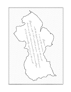
I tried to explore many different ways of filling in and framing Guyana. I worked on interest and balance, and most of the time thought about what would be pleasant to see in a travel advertisement. Some ideas were just interesting, but with three midterms and three other projects due, couldn't spend as much time as I would have liked.
Subscribe to:
Comments (Atom)